My role:
-Product Designer
-Adaptive Design
Specialist
-CMF Researcher
-Pattern Engineer
Objectives:
Make bag that is easier to recognize, feel, and use for people with blindness or visual impairments
Tools:
-Illustrator
-Indesign
-Figma
-Procreate
Timeline:
Fall 24'
9 weeks
How might I design a backpack that empowers individuals with visual impairments
to navigate and organize their belongings independently and confidently?

Research Statistics:
**Select the image to view the complete research publication**
In the U.S., there are approximately 625,000 children with extreme vision difficulty
As of 2020, an estimated 43.3 million people were blind, and 295 million had moderate to severe visual impairment (MSVI).
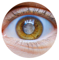
Cataracts remain one of the leading causes of blindness globally
To design with empathy and accessibility in mind, we have to consider how people with different visual impairments experience the world. The examples below represent common forms of blindness and low vision, each altering perception in unique ways. These visualizations help illustrate how drastically clarity, contrast, and detail can altered for those with visual impairments.
Understanding Blindness & Visual Impairment:


Retinitis Pigmentosa or Glaucoma
Cataracts
Macular Degeneration
Blindness is defined as 20/200 vision or worse this means someone who is legally blind must stand 20ft away to see something that someone with "perfect" 20/20 vision can see at 200ft away.
%20copy%209.png)
200ft
%20copy%2011.png)
%20copy%2011.png)
20ft
%20copy%209.png)
Why are traditional packs hard for visually impaired people to use?

Design stems from empathy. When you truly understand your user’s perspective and pain points, you’re able to create solutions that are not only functional, but impactful and deeply thoughtful.


I set out to create vision-impairment goggles to better understand how the bag I was designing might feel and function for its intended users. Since I wasn’t able to purchase off the shelf impairment goggles, I improvised using safety glasses layered with a thick, translucent waterproof material from the sewing lab. This quick, low-cost prototype gave me a more authentic sense of the challenges these users face.


This step in the process is all about ideation and organization, taking a broad concept and breaking it down into actionable steps. It involves exploring different directions, testing out ideas, and figuring out the most logical and efficient order of operations to bring those ideas to life. By mapping out the sequence of tasks, dependencies, and priorities, I can gain clarity on how each part of the process connects and builds toward the final outcome.
It’s a creativity strategy, translating individual ideas and concepts into a clear, step-by-step plan.

%20copy.png)
.png)


Next, with the full layout and order of operations conceptualized, I moved into assembly. I first sewed the small-scale prototype to confirm construction order, seam behavior, and overall fit. Then, I replicated the entire process at a full 1:1 scale to test full scale sizing and fit on the body.


Through iterative prototyping, the design became a refined balance between visual clarity, functional simplicity, and empathy-driven interaction, culminating in a backpack that communicates intuitively through both sight and touch.
This stage focused on refining the structure, proportions, and tactile communication of The Polka Pack. Each prototype explored new material combinations, high-contrast color layouts, and construction methods to improve accessibility and usability for individuals with visual impairments. Early models tested fabric layering, pocket placement, and magnetic closures, while later iterations emphasized the tactile stitching and raised polka dot textures that guide users by touch.

%20copy%2013.png)

The Polka Pack is designed with high-contrast colors and bold shapes on black fabric, making it highly visible. Bold, bright colors and shapes stand out against the dark backdrop, enhancing recognition for individuals with visual impairments. The bag features zig-zag stitching patterns that provide a tactile guide for easy identification of its structure, helping users navigate its shape and location. Instead of a zipper, the bag closes and opens with strong magnets, eliminating the need to search for a zipper. This magnetic closure is both efficient and simple, allowing for user access without strain or confusion, making the pack both practical and user-friendly.


%20copy%2012.png)
%20copy%2012.png)
%20copy%2012.png)


%20copy%202.png)

